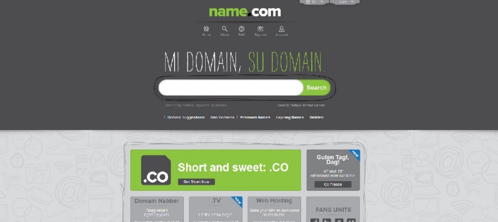
It looks like Name.com is testing out a brand new design that is totally different from their original simple, orange, black and white look. The color scheme is a very different looking lime green and dark grey. The catch line is prevalent on the site and in Spanish saying ‘Mi Domain, Su Domain’ which is a play on words for ‘Mi Casa, Su Casa’ meaning ‘My Home is Your Home’ when translated to English.
I say they are still ‘testing out’ the homepage design at this point because I haven’t confirmed this change is permanent and when you begin searching for domain registrations, you are taken back to the original site, only the homepage has been changed today.
In case you were not already aware, Name.com recently rolled out their Android App which I downloaded and use all the time. This is a free app for Android Smart phones. The Name.com Android app is full service which allows you to manage your portfolio and register domain names from your phone.


They also replaced the .CO banner with a bigger and more preminent one, as you can see in the screenshot.
I like the new design it looks eco friendly and nice and simple.
hi
now name change his homepage to old homepage
is there any one have that Html index of that homepage????
please help me
i want that